
Tech Tips
Is Your Fabric Capacity About to Trip the Fuse?
A spike on the chart isn’t always a crisis. Using everyday analogies, from bank statements to smoke alarms, we explain how to read, alert on and trace your Fabric capacity before your users notice a problem.

Switch on the kettle, the oven and the washing machine at the same time and the lights might flicker, but the fuse doesn't trip. Your Microsoft Fabric capacity behaves in much the same way, and understanding that is the key to keeping your reports running smoothly.
Fabric gives you one shared supply of computing power. Every job draws from it, from a big overnight data refresh to someone opening a sales report. Most of the time that's brilliant, because nothing sits idle. But when one hungry job hogs the supply, the first sign is often a user telling you their report won't load.
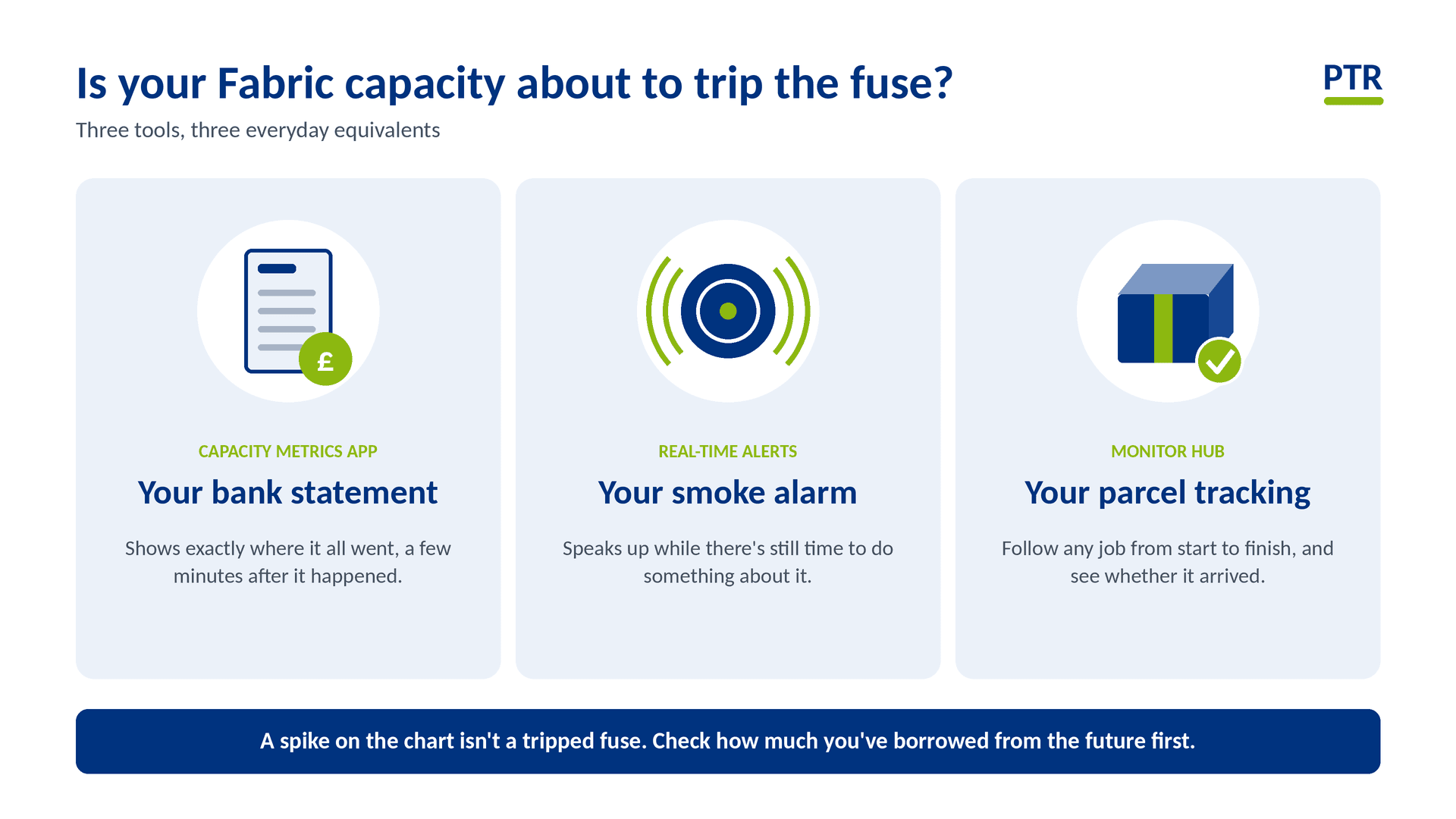
The good news is that you don't need to be an electrician to keep an eye on it. Three tools do the job, and each one has an everyday equivalent.
The Capacity Metrics app is your bank statement
A bank statement shows exactly where your money went, line by line. The Capacity Metrics app does the same for your computing power: which reports, refreshes and notebooks used the most, and when. It's free from Microsoft, and it keeps about two weeks of history.
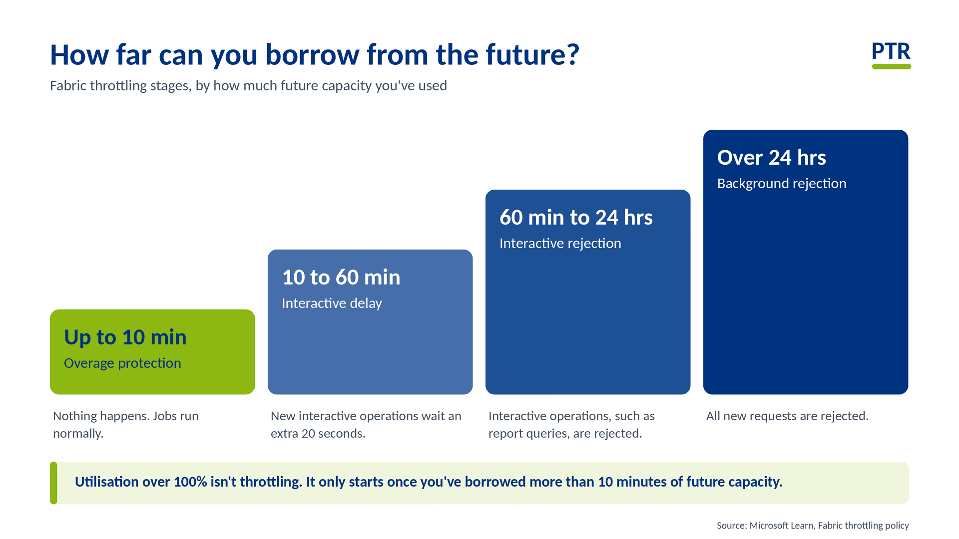
It also teaches the most useful lesson in this whole subject. Spending more than your balance for a moment doesn't mean your card gets declined. Fabric lets jobs borrow from the future and spreads the cost over time, a bit like paying for a big purchase in instalments. Your card only gets declined once you've borrowed more than about sixty minutes' worth of future supply.. So a spike on the chart isn't automatically a crisis. The chart to watch is the one that shows how much you've borrowed.
Like a statement, it's accurate but a little behind. Expect it to be 10 to 15 minutes late, so it's great for working out what happened, but it won't ring you while it's happening.
The new version, announced at FabCon Europe in Barcelona and currently in preview, is built to be read at a glance, with heat maps that show your busiest hours. It's the difference between a page of transactions and a simple chart of your spending by day, and it's much easier to show to colleagues who aren't technical.
Real-time alerts are your smoke alarm
A bank statement is brilliant for working out where the money went, but only once it's gone. A smoke alarm is different: it speaks up while there's still time to do something about it. The statement can't send you a warning, so Fabric has a separate alarm system for that: Real-Time hub alerts.
You can set them to message you on Teams or send an email when your capacity is getting close to the point where users would notice a slowdown. Microsoft even provides ready-made templates, so setting one up is quick. You can also switch on a banner that tells users when a capacity is struggling, so they know it's not just their laptop.
A few of the more detailed alerts are still in preview, but the basic alarm is there for the taking.
The Monitor hub is your parcel tracking
When a parcel goes missing, you don't look at your bank statement. You open the tracking page and see where it went, when, and whether it arrived. The Monitor hub does that for your Fabric jobs: every refresh, pipeline and notebook, with its start time, how long it took and whether it succeeded.
Put it next to the Metrics app and you can follow a spike on the statement straight back to the exact job that caused it. Often it's a single notebook doing far more work than anyone realised.
Why report users notice first. Think of a shop with a counter and a stockroom. Customers at the counter (people opening reports) expect an instant answer, so they notice any queue immediately. Deliveries in the stockroom (overnight refreshes) can wait a while without anyone noticing. Fabric treats the two differently for exactly this reason, which is why report users are usually the first to feel the pinch when capacity runs short.
Three habits worth adopting
Look before you panic. A spike on the chart isn't a trip. Check how much you've borrowed from the future first.
Fit the alarm. Set up alerts so you hear about trouble before your users do.
Give it an owner. Someone should look at capacity health regularly, not only when people complain.
Want the detail behind the analogies, including the exact thresholds, the pages to look at and the new preview features? Our technical companion, "How to Monitor Your Microsoft Fabric Capacity", walks through it step by step.
How PTR can help
PTR blends hands-on Fabric consultancy with training. We can review your capacity with a Data Platform Health Check, set up monitoring and alerting that suits your workloads, and train your team to read the numbers with confidence.
If you'd like a second pair of eyes on your Fabric capacity, get in touch.
MD
Mandy Doward
Managing Director
PTR’s owner and Managing Director is a Microsoft certified Business Intelligence (BI) Consultant, with over 35 years of experience working with data analytics and BI.
Frequently Asked Questions
Couldn’t find the answer you were looking for? Feel free to reach out to us! Our team of experts is here to help.
Contact Us